
Measuring Prosperity—Navigating the Options
Christine Corlet Walker and Tim Jackson
CUSP Working Paper Series | No 20

Summary
Since its development in the 1930s, GDP has been the most widely used measure of the health and progress of an economy, being adopted as the principal policy objective of countless national and international bodies across the world. Its many shortcomings as a measure of progress are well documented, and the alternative indicators of progress developed in response to these shortcomings have been diverse and numerous. This paper synthesises the literature, discusses the benefits and disadvantages of the different types of indicator, and elaborates on five prominent case studies in detail. It further considers two of the key debates in the literature—the challenge of aggregation and the question of monetisation—through a lens of policy and practice. In this way, we lay a roadmap for interested parties to navigate the many alternative indicators of progress. This work highlights the importance of context and purpose in determining what makes a ‘good’ indicator. We, therefore, propose a key distinction between two common indicator types: 1) indicators which primarily act as narrative or ‘story-telling’ devices, and 2) indicators which primarily act as decision aids for policy. We reflect in detail on what makes a successful and influential indicator in each of these contexts.
Scope and structure of the working paper
This working paper has three main objectives:
- Draw together the existing literature on alternative indicators of progress, for reflection
- Provide a guide for navigating the many indicators available to governments and other interested parties
- Outline what makes a good indicator, and how their use and influence can be encouraged
In order to address these objectives, we reviewed the most up-to-date literature on alternative indicators of progress, beyond GDP (alternative indicators hereafter), assessing the technical benefits and limitations of different types of indicator. This work was further grounded in discussions with practitioners about their main concerns and priorities with regards to the use of indicators in policy-making.
The paper has been structured around the objectives above, with Section 1 focusing on the traditional arguments about the shortcomings of GDP as a measure of wellbeing, economic welfare and distribution. Section 2 moves ‘beyond’ GDP to present a typology of alternative indicators of societal progress, discussing key examples of each indicator type. Section 3 provides a detailed account of five of the most widely used indicators to explore some of the benefits and disadvantages of the different indicator types more tangibly. Section 4 lays a roadmap for navigating the main debates in the literature around indicator aggregation, monetisation and use of subjective wellbeing indicators. It also aims to outline what characteristics make a good ‘story-telling’ indicator, as compared to a good decision-support indicator. Section 5 offers some concluding remarks.
1 | What’s GDP got to do with it?
“Indicators” are often chosen as the medium for delivering information about the economy, human wellbeing and environmental sustainability (among other issues) to decision-makers. This is, in part, because they allow extensive and detailed information to be condensed into a concise and simple format.[1] This is particularly useful in the context of high-level policy decisions which deal with complex, large-scale systems. However, due to the multifaceted and often subjective nature of topics such as wellbeing, debates over which are the best indicators for the job are ongoing and far from resolved.
Since its development in the 1930s, Gross Domestic Product (GDP) has been the most widely used measure of the health and progress of an economy, being adopted as the principal policy objective of countless national and international bodies across the world.[2]. “One of the reasons for this is the tendency to equate increasing GDP with improved wellbeing and a better quality of life. Rising GDP traditionally symbolises a thriving economy, more spending power, increased family security, greater choice, richer and fuller lives, more public spending and better public services”, p3.[3] But does it actually measure what we want it to measure?
1.1 GDP as a measure of wellbeing
There have been many empirical studies showing that individual income is indeed related to subjective measures of wellbeing,[4] although the exact shape of this relationship is still contested.[5] Historical GDP growth has also arguably brought with it some large-scale improvements in wellbeing; in particular, contributing significantly to poverty alleviation across the world (although this is also contested).[6] However, at high income levels diminishing marginal returns to income mean that other factors may become more important in determining an individual’s subjective wellbeing than income.[7] This argument could be extended to national-level wellbeing; for example, with the quality of our social relationships potentially being more important in determining aggregate national wellbeing than GDP (in places where GDP is already high). This raises concerns about potential unintended consequences of neglecting these ‘other factors’ in our decision-making.
1.2 GDP as a measure of economic welfare
Gross Domestic Product only counts the costs and benefits of economic activity which are captured in the market. This is a problem for a number of reasons. First, the diverse costs, or ‘negative externalities’, associated with economic activity are not properly accounted for. For example, manmade and natural disasters are captured in GDP primarily through increases in defensive expenditures (i.e. those expenditures which aim to prevent or minimise damages incurred by an individual or group)—such as reconstruction of destroyed public infrastructure, pollution clean-up efforts and fines for offending parties—and through indirect damages, such as reductions in income as a result of reduced opportunities for production.[8] This often leads to net increases in short-run GDP after such events and does not reflect the potentially large non-market costs to society and nature (both short and long-run), such as the permanent loss of cultures, livelihoods and ecosystem goods and services.
Second, the focus of GDP on market activity alone fails to incorporate the benefits to society of those goods and services which are provided outside the market,[9] such as household labour, volunteer work, services provided through the sharing economy, and ecosystem goods and services, among others. These goods and services contribute substantially to the economy. For example, using average market earnings, the Office for National Statistics calculated that the total economic value of unpaid work in the UK in 2014 was more than £1.01 trillion, or 56% of GDP.[10] One significant result of omitting information about such costs and benefits is that it obscures which sectors of the economy (both within and outside of the market) are generating the greatest net wellbeing benefits to society, thereby leading to a potential misallocation of resources by decision-makers.[11]
On a related point, GDP fails to distinguish appropriately between intermediary and final goods, and can therefore not be regarded as a consistent measure of economic welfare. For example, it counts investment in roads and work-related spending by households as final goods, although they are clearly only intermediary in the production of economic welfare.[12] These factors reveal that GDP is even a poor measure of economic welfare, and give us pause to think about whether there are better ways to capture the values we are interested in.
1.3 Distribution of income and the GDP
Gross Domestic Product does not capture the distribution of the costs and benefits of economic activity among different groups within society.[13] Understanding the distribution of income, and wellbeing more broadly, is important for two main reasons. One, the concept of diminishing marginal utility of income tells us that high-income individuals are likely to experience a smaller increase in wellbeing as a result of one additional unit of income than low income individuals.[14] This indicates that if GDP is highly concentrated, with a few people earning the majority of the income, those few individuals would achieve less additional wellbeing from every extra unit of income than if that income were to be redistributed to individuals who have very little. Taking this concept, Jackson (2018) estimated that the welfare lost in the UK as a result of inequality in 2016/17 was equivalent to £240 billion.[15] From a purely economic point of view, therefore, this might lead us to view reducing inequality as one key component of improving aggregate wellbeing.
Two, empirical evidence shows that high levels of income inequality might act as a catalyst for other social issues, which detract from societal wellbeing. Income inequality is, for example, associated with a number of factors at the national scale, including high rates of violent crime, low educational achievement and poor health.[16] Although these relationships need further investigation to account for confounding factors, these studies suggest that income inequality can have a substantial effect on wellbeing outcomes.
2 | Moving ‘beyond’ GDP
There have been many initiatives to replace, augment and complement GDP over the years, with many dozens of indicators being devised and implemented at the local, national and international scales. These indicators have ranged widely in their focus, with some aiming to account better for human wellbeing, whilst others aim to reflect more accurately the state of our natural environment, and others still aim to capture economic activity more holistically.[17] The indicators further vary in their approach to measurement, from the data they use to the aggregation processes they implement.[18] This diversity makes the ecosystem of indicators difficult to navigate, and it can become an overwhelming task to identify the ‘best’ indicator for any given context.
Below we will provide an overview of the various types of indicator that have been developed, with a short description of how they work, some brief examples, and their key benefits and disadvantages. Alongside the case studies in Section 3, this overview will provide a backdrop for the discussions in Sections 4.
We use here a common categorisation of indicators, distinguishing between the following types:
- indicator sets (or dashboards);
- aggregate non-monetary indices;
- aggregate monetary indices; and
- subjective wellbeing indices.
We chose this categorisation approach because it best reflects the key points of tension in the indicator debate to date; namely around the monetisation of wellbeing and nature, the aggregation methodologies used to create the indices, and the validity of measures of subjective wellbeing.[19] These are all areas that will be explored in more detail in Section 4. Other classification approaches do exist, which instead reflect factors such as the objectives of the indicator, its disciplinary origins, or the content of the sub-indicators;[20] however, these are less informative for this working paper.
2.1 Quality of life indicator sets or dashboards
Quality of life indicator sets are comprised of a wide range of physical or socio-economic factors which are considered important contributors to wellbeing. They are then often arranged into a set of domains (and sometimes sub-domains), which are considered to represent the main contributors to wellbeing or progress. The fundamental aim of such indicator sets is that they should “make up a ‘quality of life barometer’ which will be used to measure ‘overall progress’ towards ‘a better quality of life for everyone, now and for generations to come’”.[21]
Examples of dashboard indicator sets include:
- the UK’s Sustainable Development Goal Indicators, which are comprised of 114 indicators that are considered to sit with the domains of economy, society and environment. Each indicator is assessed according to its short and long term trends.[22]
- the System of Environmental- Economic Accounting (SEEA), which “is a framework that integrates economic and environmental data to provide a more comprehensive and multipurpose view of the interrelationships between the economy and the environment and the stocks and changes in stocks of environmental assets”.[23]
- the Eurostat Quality of Life indicators, which are comprised of nine distinct domains of wellbeing, determined by an expert group. It does not include environmental measures, but does capture subjective assessments of wellbeing.
“The advantage of developing extended indicator sets of this kind is obvious. It allows Governments at any one point in time to assess progress towards key social or environmental policy targets, and to understand how trends in different factors are evolving”[24]
One of the major advantages of sets of indicators is that there are no restrictions on which indicators can be included since they don’t need to be aggregated. Therefore, the main constraint on the number of indicators included in such sets is simply the aim of producing a succinct and simple tool for use. There is also no need for a normative direction to be associated with success for these indicators; however, the use of goals and trends can be useful in allowing some quite obscure statistical quantities (e.g. natural capital) to become meaningful and resonant concepts for the public and policy makers.
In spite of these advantages, Barrington-Leigh and Escande (2018) found little evidence of policy impact associated with these kinds of indicator sets. According to the authors, they seem to have good longevity (perhaps because national statistical agencies often collect this kind of data for other purposes anyway), but limited practical use in policy making thanks to their somewhat unwieldy nature and subsequent lack of resonance with policy-makers. In particular, these kinds of indicator sets give policy makers no indication of the importance of one indicator with respect to another, leaving them with questions about how to interpret these dashboards when some indicators improve and others decline. How can we understand and articulate a notion of ‘overall progress’ with this kind of indicator system? Hence, while preserving a distinct set of indicators “avoids the dumbing-down of the complex and multidimensional concept of progress, it may relegate such efforts to the role of data clearinghouses, rather than significant contributions to reframing and redirecting public conceptions and dialogue, or to providing accountability for policy”.[25]
2.2 Aggregate non-monetary indices
Aggregate non-monetary indices attempt to combine the values for a set of ‘objective’ contributors to quality of life into one single number, or ‘scalar index’. This scalar index is generally calculated as the weighted sum of these contributors after they have gone through some rescaling or ranking process.
Examples of this type of indicator include:
- the Human Development Index (HDI), which is arguably the most well-known of this kind of indicator. It combines life expectancy at birth, mean years of schooling and gross national income per capita using an unweighted average. Minimum and maximum ‘goalpost’ values are used for each sub-component to generate values for inclusion in the index along a scale from 0 to 1.
- Bhutan’s Gross National Happiness (GNH) index, which uses threshold values to calculate sufficiency across nine happiness domains. If someone meets the sufficiency threshold for six out of nine of the GNH domains, they are considered to be happy. It then uses the Alkire-Foster method for measuring multidimensional poverty to aggregate the individual happiness data into a measure that reflects GNH across Bhutan.[26]
- the Canadian Index of Wellbeing (CIW), which uses an unweighted average of the ‘percentage change’ from the base year in the underlying indicators in order to generate the index value. The index domains cover community vitality, democratic engagement, education, environment, healthy populations, leisure and culture, living standards and time use.
Aggregate non-monetary indices can capture a concept like progress or wellbeing in a single value, which holds a number of advantages. It allows the summary measure to be tracked over time, compared easily between nations, and effectively communicated. This offers a neat way of articulating the ‘general direction of travel’ for a society, and can provide an accessible way for the public and policy makers to understand the data underlying it.[27]
It is possible for these indices to offer a useful tool to support cost-benefit analyses by exploring the impacts of different policy decisions on the indicator values. However, the usefulness of these kinds of indices as such tools is “limited by the meaningfulness of the index”.[28] In other words, if there is no robust theory or empirics underpinning the weightings used in the index, then the resulting number, and any changes in it may be essentially meaningless. This is because the weighting process applied to the values of the underlying indicators can dramatically change the outcome of the index.
Becker et al. 1987[29] showed that, when measuring quality of life in the United States, the exact weight given to each sub-indicator dramatically changed the inter-region rankings. In the extreme, the authors found that for 59 cities, their rank could shift from first place to last, depending on how the sub-indicators were weighted. The lack of cohesive theory supporting indicator weights is troublesome not only in terms of relative rankings but also in an absolute sense. For example, the effects of trade-offs (e.g. between GDP and tonnes of CO2 emitted) and synergies (e.g. between years in education and quality of employment) between sub-indicators can be either exaggerated or diminished, depending on weightings. Hence, if the weightings are arbitrarily chosen, or chosen to manipulate the index, then the resulting number may be at best meaningless and at worst misleading.
2.3 Aggregate monetary indices
Aggregate monetary indicators describe the set of alternative indicators that aggregate all those factors contributing to (or detracting from) wellbeing which can be expressed in monetary terms. These kinds of indicators could be most accurately described as alternative measures of economic welfare, rather than measures of human wellbeing or societal progress. This approach to indication is largely a response to the critique that the GDP leaves out valuable economic activity that happens outside the market, and ignores many of the negative externalities associated with economic activity that happens inside the market.
Some well-known aggregate monetary indicators include:
- Adjusted Net Savings/ Inclusive Wealth Index, which attempts to measure the “true rate of savings in the economy” after taking account of the depreciation of, and investments in, man-made, natural and human capital.[30]
- the Index of Sustainable Economic Welfare (ISEW)/ Genuine Progress Indicator (GPI), which aimed to “include the contribution to economic welfare of the informal economy, correct for the social and environmental costs of production, and take account of so-called defensive expenditures”.[31] The ISEW methodology is based on the assumption that estimates of market price can tell us something about the how much individuals are willing to pay for a particular ‘welfare-enhancing’ good or service, and hence how much the value it.
The main advantage of this approach is its acceptability to decision-makers. As Barrington-Leigh and Escande (2018, p902) describe, “in the context of a strong existing focus on GDP growth and a widespread implicit assumption that other desirable outcomes are likely to be correlated with GDP”, these kind of monetised accounts “wield rhetorical power in highlighting the differences resulting from more inclusive or more discerning coverage in the accounts”. Further, having one, scalar value that is intuitive to interpret makes these indices highly resonant with the public and policy-makers.
One drawback of monetised indicators is that, because the additional activities they are trying to capture do no fall within the confines of the market, they have to be valued using arguably more normative methodologies, such as contingent valuation and shadow pricing. Decision-makers may view these methods as more difficult to justify, which undermines their faith in the resulting values. A further, and potentially more damning drawback is that these indicators fall foul to some of the same criticisms levelled at GDP to begin with. In particular, although monetised indices like the GPI greatly extend the activities and investments included in the measure of wellbeing, it can still be considered limited by what it is ‘feasible’ to put a value on. This leaves potentially significant contributors to sustainable wellbeing, such as cultural values out of the equation. Additionally, these indicators do not overcome the challenge that the link between the market value of economic activity and “experienced human wellbeing” is weak.[32]
2.4 Subjective wellbeing indicators
“A very different approach to the measurement of wellbeing derives from the understanding that economic resources are not in themselves final goods, but only intermediary in the ‘production’ of human wellbeing. Final welfare, according to one economist, ‘consists of states of consciousness only and not material things’ at all”.[33] This perspective has led many to develop indicators that capture an individual’s subjective measure of their own experienced wellbeing, which can be aggregated at the national level.[34]
Examples of subjective wellbeing indices include:
- NEF’s National Accounts of Wellbeing, which is a composite indicator comprised of a range of subjectively-assessed sub-indicators. These sub-indicators cover personal wellbeing, social wellbeing, and wellbeing at work; assessing a range of subjective feelings, from self-esteem to autonomy, trust and belonging, among others.
- the Gallup World Poll Cantril Ladder, which is a simple single life evaluation question that is averaged across a country’s population.
One suggested advantage of subjective measures of wellbeing is that subjective wellbeing is an apparent or observed outcome, which means that there is no need to guess at the contributing factors to quality of life. Hence, “individuals can aggregate their experience in accordance with their own priorities and values in a way that no one else can and, according to many proponents, indeed in a way to which any other concept of wellbeing should ultimately be accountable”.[35]
Subjective measures of wellbeing vary in their form, from single ‘life evaluation’ questions, to more complex, weighted indices, which include subjective evaluations of different contributors to wellbeing (e.g. housing quality). Although the more simple subjective wellbeing (SWB) measures do not face the same challenges of aggregation that more complex indices do, they can be more susceptible to one off-events, mood swings, etc. These fluctuations in a single ‘life evaluation’ measure cannot be ground-truthed in the same way that a subjective index, based around certain objective components of wellbeing, could be. Further, although these metrics may provide a reflection of human wellbeing, there is no reason that they will necessarily reflect sustainability priorities. Here we see the importance of complementing such metrics with ideas about constraints on resource use and pollution.
3 | Indicator case studies
In this section we discuss in detail five prominent indicators that are representative of the types of indicators explored in the previous section:
- New Zealand’s Living Standards Framework (NZ LSF)
- Social Progress Index (SPI)
- Adjusted Net Savings (ANS)
- Genuine Progress Indicator (GPI)
- Happy Planet Index (HPI)
The first exemplifies the ‘dashboard’ approach; the second an aggregate non-monetary index; the third and fourth are examples of monetised aggregate indicators and the fifth, something of a hybrid, incorporates subjective wellbeing as a key component. Across the five types of indicators are varying degrees of policy-readiness, narrative strength, and distance to implementation.
For each indicator we outline the genesis of the idea and its main proponents, if and where the idea has gained traction, and the level of acceptance and uptake achieved. We analyse enabling factors and barriers to uptake, political and practical feasibility of the indicator, as well as data availability and methodological robustness. See Table A.1 in Appendix A for a summary of key indicator characteristics for each of the selected case studies.
3.1 New Zealand Living Standards Framework
Indicator background
The NZ LSF dashboard was built on 10-15 years of work within Treasury developing the framework, and even longer developing the wellbeing concepts behind it, spanning all the way back to the 1988 Royal Commission on Social Policy. The development of the NZ LSF was ultimately precipitated by a few key individuals who wanted to do something about the discrepancy between what GDP can reflect and the ultimate aim of the Treasury: to make life better for the people of New Zealand. This reflected a recognition that, if Treasury is making decisions about the government’s expenditure on health and education, then they should consider a broader set of factors than just GDP. Although having key figures pushing the NZ LSF agenda forwards has been key to its success, it has also resulted in one of its main challenges: achieving widespread buy-in. This was exacerbated by the new Labour government, who took power in 2017, asking for rapid progress in a range of areas. This left little time to bring civil servants on side.
Indicator construction
The NZ LSF dashboard is comprised of 38 indicators, which sit across 12 domains of wellbeing. It draws heavily on the OECD’s wellbeing approach in order to allow comparisons with other nations. Indicator selection was informed by expert advice and public consultation, and outlined through a series of formal discussion papers.[36] The final selection of indicators was ultimately constrained by the availability and quality of data.
The dashboard is comprised of three sections, each of which allow for distinct but important analyses:
- “Our people—describes the distribution of wellbeing across nine current wellbeing domains[37] for different population groups of New Zealanders, using characteristics such as sex, age, ethnicity, family type, region, hours worked and neighbourhood deprivation.
- “Our country—describes the current wellbeing of New Zealanders at a national level with comparisons within New Zealand population groups and other OECD countries, using 38 indicators that measure the 12 current wellbeing domains.
- “Our future—provides indicators for the resources that underpin the ability to sustain higher living standards in New Zealand now, and in the future”[38].
From these indicators we can see that there is a fairly comprehensive treatment of the economic, social and environmental dimensions of wellbeing. Of particular note: the dashboard includes both objective and subjective measures of wellbeing; it treats distribution across a range of characteristics; and it considers the long-term sustainability of its activities through changes in capital stocks. In this way, the NZ LSF aims to capture the wellbeing and resilience of current and future generations.
Importantly, the Treasury opted not to aggregate its indicators. The decision was rooted in the idea that the aggregation process is ultimately very value-laden, and that it is the role of elected ministers to decide what factors are more and less important than others. One practitioner also commented that, from a policy perspective, if you see a change in an aggregate indicator, you immediately want to know what’s causing it. For that, you have to go back to the dashboard anyway. Further, the Treasury chose not to opt for a monetary account within the LSF. Despite diverse views within Treasury on this front, practitioners noted that the decision was ultimately taken on the grounds that you might lose valuable information through the monetisation process.
Considering the dashboards’ treatment of the environment more closely, we see that environmental indicators are included in the LSF in two ways. First, the ‘our country’ domain of the dashboard specifically considers the contribution of the environment to current generations’ wellbeing. This is reflected through four indicators: air quality, access to the natural environment, water quality and perceived environmental quality. Second, within the ‘our future’ domain of the dashboard the environment is considered as a stock of natural capital which underpins the resilience of life and human activity, now and in the future. Natural capital here is measured through six indicators: natural hazard regulation, climate regulation, sustainable food production, drinking water, biodiversity and genetic resource, and waste management.
The selection of indicators in the natural capital sub-domain was based on a mix of pragmatic considerations about data availability, and the indicator’s relevance to policy and future wellbeing. This process was informed by international natural capital frameworks, such as the United Nations System of Economic-Environmental Accounting Experimental Ecosystem Accounting (SEEA-EEA), the Mapping and Assessment of Ecosystem Services (MAES) and the Common International Classification of Ecosystem Services (CICES). The disaggregated nature of these indicators also maintains a strong sustainability approach, where natural capital cannot be simply substituted by another form of capital and must be maintained in its own right. These environmental indicators within the LSF both send a strong message about the importance of nature for human wellbeing, and also about the importance of maintaining a constant (or increasing) stock of natural capital for the wellbeing of future generations.
Indicator outputs
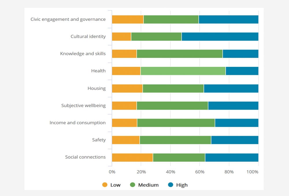
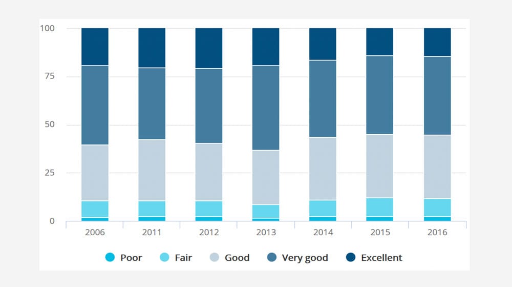
The online dashboard can be used in a variety of ways. It can be used to track each of the nine wellbeing domains over time for different sub-groups of the population, or at the national level. For example, Figure 1 shows the percentage of adults with low, medium and high levels of wellbeing in each of the nine wellbeing domains. Figure 2 then focuses in on one of the wellbeing domains, asking what percentage of the adult population rates their health as poor, fair, good, very good, or excellent, for the years 2006-2016.
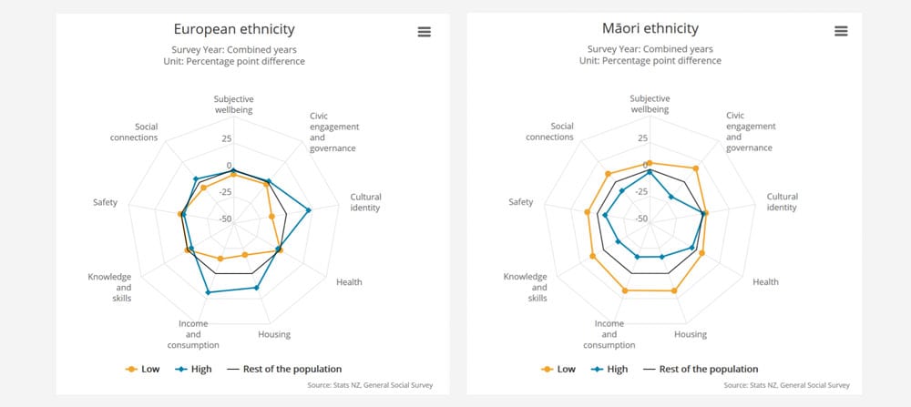
It can also be used to produce comparison graphs, showing how different sub-groups fair against one another for a given year, as per Figure 3, which shows the performance of Maori New Zealanders, as compared to European New Zealanders, along all nine wellbeing domains.
This information, along with other functions of the dashboard, can be used as a diagnostics tool to identify where the headline problems are across a range of areas. For example, New Zealand has an issue with low labour productivity.[39] That shows up on the LSF dashboard as a combination of mediocre income and long hours worked. If New Zealanders were prioritising leisure time, then we would expect the hours worked to be lower. Low productivity is therefore revealed through the dashboard to be an issue for living standards as well as for economic performance.
Indicator use
In practice, the LSF and its accompanying dashboard are “increasingly being integrated into the Treasury’s advice processes”.[40] This is happening in a number of ways, including the development of a social cost-benefit analysis tool (CBAx), using the indicators in the dashboard to support decision-processes for the 2019 budget.[41] In addition, the LSF is being used to determine 2019 budget priorities, which has been pitched as the wellbeing budget. Using the dashboard, the Treasury selected five priority areas: creating opportunities for businesses to transition to a low-emissions economy; supporting digital innovation; lifting Maori incomes; reducing child poverty; supporting mental wellbeing.[42] Those priorities shape which budget bids are accepted. In support of this, agencies are being asked to submit analyses of how their bids will affect Living Standards, including both current wellbeing and the different capitals in the LSF. Here we can see how this alternative indicator system is being used alongside GDP to determine the allocation of funds across health, education, housing, and more, based on its likely effects on wellbeing. The Treasury is expanding its capabilities to make these assessments by building the Living Standards Analysis Model, which supports policy-makers to identify trade-offs and synergies across different policy areas.[43]
3.2 Social Progress Index
Indicator background
The Social Progress Index (SPI) is an aggregate non-monetary index, which was developed by the non-profit organisation, the Social Progress Imperative, in 2013. The index was the product of a two-year consultation process with academics and policy experts, and was designed to complement GDP, rather than replace it.
Indicator construction
The SPI is underpinned by a wide body of literature, including Amartya Sen’s capabilities approach to human wellbeing,[44] as well as work “emphasising the role of institutions in shaping economic and social performance”.[45] The result of these inspirations is an index that centralises ideas of human needs, individual wellbeing and opportunity for flourishing. The framework tries to answer the following three questions:
- “Does a country provide for its people’s most essential needs?
- Are the building blocks in place for individuals and communities to enhance and sustain wellbeing?
- Is there opportunity for all individuals to reach their full potential?”[46]
In line with these questions, the index is comprised of three dimensions, under which sit four categories of outcomes (or ‘components’) each. “The selection of the dimensions and the elaboration of the components within each dimension occurred through an iterative process involving review of the literature and input from the Social Progress Imperative Advisory Board. Finally, each of the individual outcome variables making-up the components were selected on the basis of three criteria: “internal validity, public availability, and geographic coverage”[47] (Figure 4).
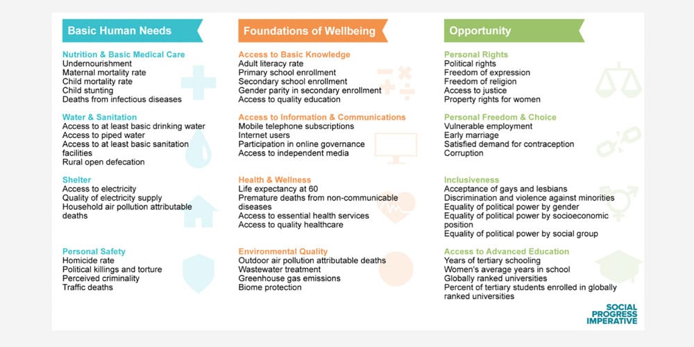
In order to account for the fact that there is some conceptual overlap between sub-indicators (e.g. undernourishment and depth of food deficit) factor analysis was used to assign weightings within the components (by estimating the amount of overlap between the subdomains and adjusting their contribution to the index accordingly). At the top level, by contrast, the three dimensions are equally weighted as the indicator developers did not feel there was sufficient evidence to support a differentiated weighting. “As in weighting across dimensions, the Social Progress Index architecture equally weights components for constructing a dimension-level score because there is no clear theoretical or empirical reason to weight any of the components more highly than any other. For this reason, each dimension score is composed of the simple average across the four components”.[48]
Although they weight the sub-indicators within each component using factor analysis, by giving all components and dimensions equal weights, the different components are implicitly being giving equal importance in determining wellbeing. This ignores the existence of trade-offs, synergies and the fundamental underpinning of one factor by another. The potential impact of this in a decision-making context should not be underestimated.
The treatment of the environment in the SPI is meant to reflect both its contribution to human survival, in an immediate sense, and to the long-term resilience of communities. This is captured in the most recent version of the index with “Environmental Quality” as one of the four components in the “Foundations of Wellbeing” domain. The component is comprised of four indicators: outdoor air pollution attributable deaths and wastewater treatment (which contribute to immediate health of communities); and greenhouse gas emissions and biome protection (which contribute to future resilience of communities and the planet more broadly). This approach to capturing the importance of the environment for human wellbeing is fairly light-touch and does not reflect either an extensive, or a theoretically grounded, approach to including the environment in the SPI.
Indicator outputs
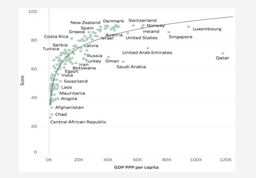
The SPI has been calculated for a very large number of countries. As a result, it offers a promising index for high-level international comparisons. If given an international platform, this level of data coverage and transparency may act as an accountability tool, bringing into sharp relief the ability of a country to meet the basic needs of its citizens. This characteristic of the index comes largely as a result of the prioritisation of global data availability and consistency in its design. Further, the comprehensive nature of the data allows interesting analyses to be conducted which can help to decompose the relationship between GDP and societal progress. For example, Figure 5 shows the relationship between GDP per capita and the SPI index score for each country in the index.[49] Here we can see that the SPI shows diminishing returns to GDP per capita when calculated across countries.
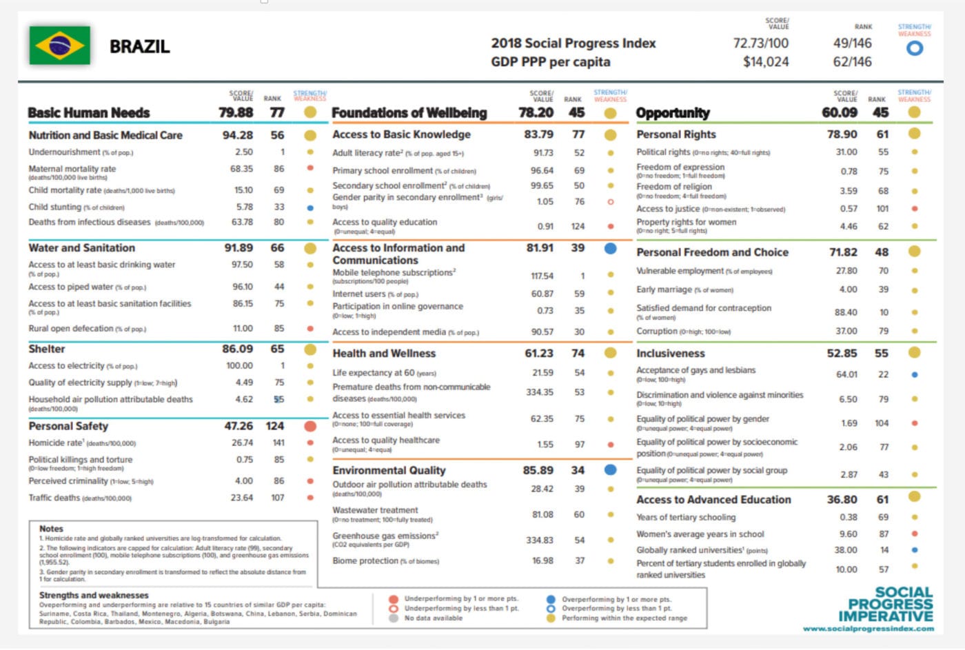
The Social Progress Imperative have also produced scorecards for each of the 146 countries in the index, which indicates how the country is performing when compared to 15 other countries with similar GDP per capita. In other words, it gives a relative impression of how efficiently the country is producing wellbeing for its citizens. For example, if we consider Brazil, according to the SPI it is underperforming on Personal Safety, with higher than average homicide rates and traffic deaths, given its GDP per capita. However, it is performing better than expected on Access to Information and Communication, and Environmental Quality (see Figure 6 for scoreboard). This presentation of the information contained in the index might highlight productive avenues for policy learning and best-practice-sharing between countries.
Indicator use
The appealing and flexible presentation of the results of the SPI allows for an engaging story to be told about global social progress. There is now a global network of actors from government, business, academia and civil society championing the use of SPI. Notably, the Paraguayan government have officially adopted the index as part of their National Development Plan. This has already led to tangible impact, with the government doubling its funding for nutrition programmes in response to the SPI data. Further, “in Brazil, multinational corporations like Coca-Cola, Natura and Fiat-Chrysler are using customized indexes to ensure their supply chains are socially and environmentally sustainable”.[50] In this way, the index is arguably more useful as a dashboard of indicators, rather than an aggregate index, particularly given the socially-ambiguous weighting choices.
3.3 Adjusted Net Savings
Indicator background and construction
The Adjusted Net Savings (ANS) (also called Genuine Savings) is a monetary indicator which aims to capture the true savings rate of the economy. It is defined as “gross national savings adjusted for the annual changes in the volume of all forms of capital”.[51] In other words, it looks beyond traditional measures of national wealth/ savings, to include measures of natural resource depletion, damages from pollution, and investments in education. The ANS indicator can be approximated by the following equation:
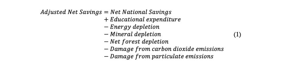 Adjusted Net Savings is then presented as a percentage, by dividing it by the Gross National Income.[52] The idea of considering the sustainability of an economy in terms of changes in the stock of wealth was formally developed by Pearce and Atkinson in 1993, drawing on theories about weak sustainability.[53] Weak sustainability suggests that in order for the economy to be considered sustainable, the overall stock of natural and manmade capital must not be decreasing. This definition of sustainability is based on the assumption that there is perfect substitutability between these two forms of capital. In other words, increases in manmade capital can compensate—in terms of maintaining a constant stream of consumption per capita—for the loss of natural capital (e.g. through technological advancements that allow us to use the remaining natural capital more efficiently).[54]
Indicator outputs
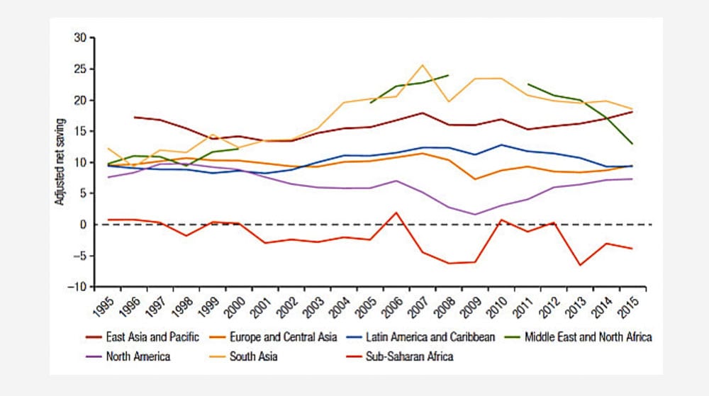
The ANS work was expanded by the World Bank, who have now developed a 47-year time series for every country (data permitting).[55] This data was first published for more than 200 countries in the World Bank’s Little Green Data Book in 2000. These figures are now reported annually.[56] The World Bank database allows for rapid and extensive comparisons over time and across countries. In particular, their online tool allows the ANS data of individual countries, or groups of countries, to be plotted over time and decomposed according to its base components. For example, in Figure 7 we can see the trend in Adjusted Net Savings for each continent, from 1995-2015.
Indicator use
The World Bank-led Wealth Accounting and Valuation of Ecosystem Services (WAVES) partnership are working with national governments around the world to promote sustainable development. They try to achieve this through the mainstreaming of natural capital into development planning and national economic accounts, using indicators such as the ANS.[57] Their core implementing partners so far include: Guatemala; Costa Rica; Colombia; Zambia; Botswana; Madagascar; Rwanda; Indonesia and the Philippines. This indicates that governments may be receptive to the ideas captured through the ANS indicator. However, given the implicit treatment of all capitals as essentially substitutable, this indicator may not provide these governments with a suitable reflection of long-term sustainability.
3.4 Genuine Progress Indicator
Indicator background and construction
In order to talk about the Genuine Progress Indicator (GPI), we first must look at the Index of Economic Welfare (ISEW), which was developed by Herman Daly and John Cobb in the appendix of their 1990 book “For the Common Good”.[58]. The ISEW is an extended monetary account that was designed to start from a baseline of personal consumption (much like GDP), and to adjust that figure to account for a number of additional costs and benefits not included in the GDP metric, such as non-market production and environmental degradation.[59] The main components of the ISEW can be approximated as follows:
ISEW/GPI = Cadj + Gnd + W – D – E − N
“where Cadj is personal consumption expenditures adjusted for income inequality, Gnd is non-defensive government expenditures, W is nonmarket contributions to welfare, D is defensive private expenditures, E is the costs of environmental degradation, and N represents depreciation of the natural capital base”.[60]
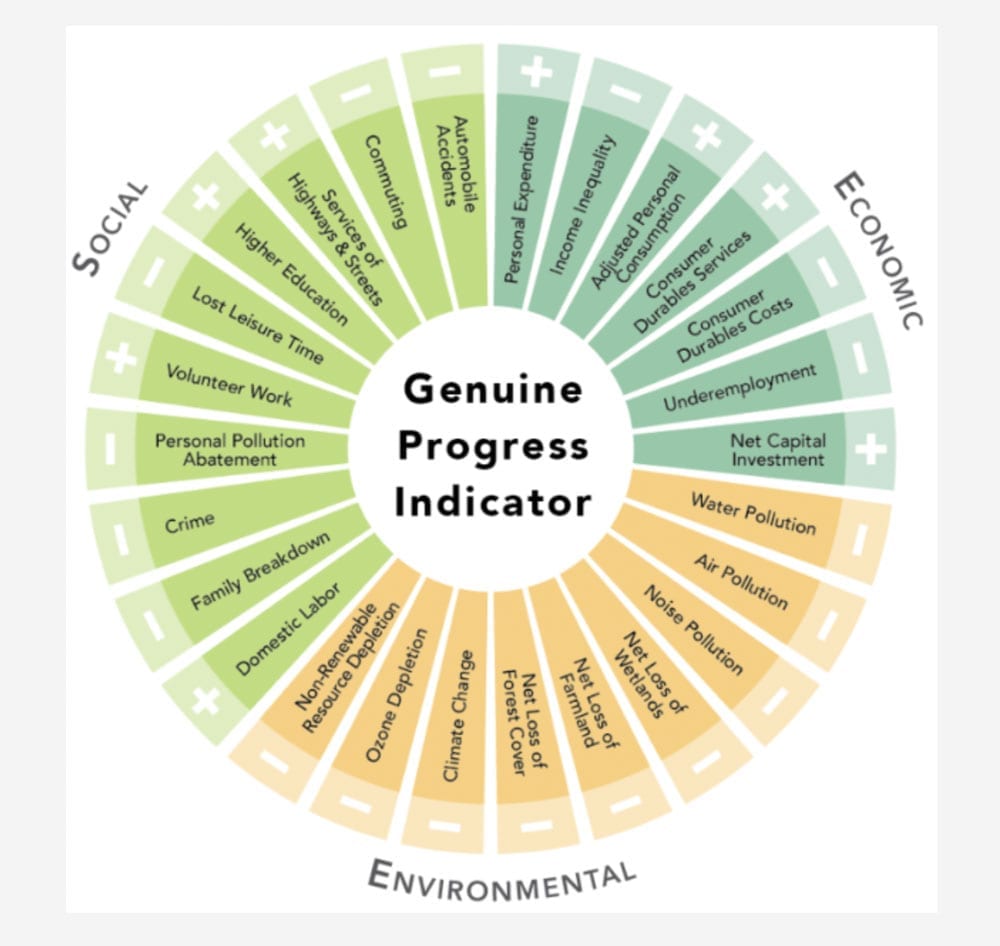
This approach to measuring economic welfare is rooted in the ‘threshold hypothesis’: “the notion that when macroeconomic systems expand beyond a certain size, the additional cost of growth exceeds the flow of additional benefits”.[61] ISEW-style metrics of progress represent an attempt to measure the benefits and costs of economic activity not usually captured in GDP, in order to act as a kind of signal for when growth in an economy becomes uneconomic. The exact methodology of the ISEW has evolved over the last 30 years, undergoing a rebranding as the Genuine Progress Indicator in 1995, led by the think tank Redefining Progress. Both the ISEW and GPI are still in use today, with very similar methodologies. Most iterations of the ISEW/ GPI now include some close variation on the list of sub-indicators shown in Figure 8.
The methodological advances achieved for the GPI include both the inclusion of additional factors in the index and the advancement of valuation methodologies for specific sub-indicators in the GPI. Approximately one third of the sub-indicators in the GPI represent environmental factors. They include water, air and noise pollution; loss of wetlands, farmland and forest cover; climate change; ozone depletion; and non-renewable resource depletion. The indicators are monetised using a range of methodologies, which often vary depending on the specific GPI initiative or study. For example, some studies measure the value of ecosystem services, whilst others measure the cost of their loss. Each GPI study should therefore be evaluated individually for robustness. They are, however, all based on the idea of attempting to bring the negative environmental externalities associated with economic activities—at least those which can be monetised—into our assessment of societal progress.
Indicator use and outputs
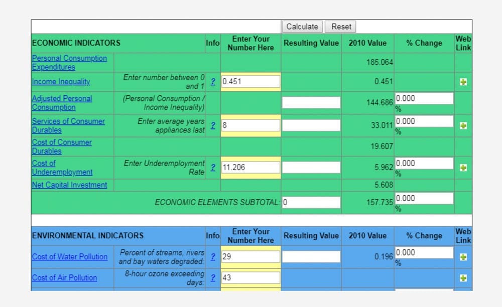
The GPI has also managed to gain some political traction in a number of countries, including, Australia, the UK[62] and the US. Most notably, a handful of US states have adopted the GPI, embedding it in their state-level policy processes. In particular, Maryland state government has adopted the GPI at the behest of the Governor, who has promoted the Maryland GPI since its unveiling in 2010.[63] As a result, GPI statistics are “regularly updated and used in analysis of state-level policies and decisions”.[64] Maryland state government also set the gold standard in accountability with an online tool that allows the public to see how changing policy priorities (e.g. reducing water pollution) might affect the GPI. It achieves this by allowing them to select target values for key components within the index (Figure 9).[65]
The opaqueness of government decision-making makes it difficult to say with certainty how well the GPI is being integrated into budgetary decision processes and policy priority-setting in places like Maryland. However, the GPI also plays an important role in shifting the public discourse, with striking and intuitive analyses revealing the disparity between trends in GDP and trends in GPI across a multitude of countries, globally.[66] See Figure 10 below for a graph showing the estimated global trends in GPI and GDP, from 1950-2005. This illustrates the often divergent patterns shown by these indicators.
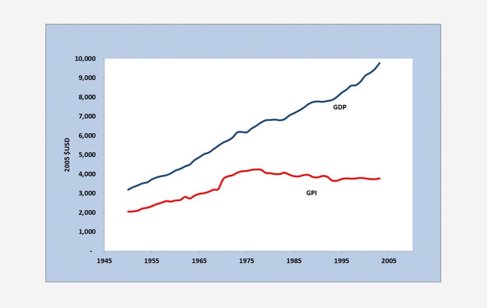
Regardless of its limitations, the GPI offers a more holistic view of the level of economic welfare being generated through the economy than GDP. When we assess the economy on the basis of the GPI, we see that our economic welfare may in fact be stagnating or declining, even where GDP is increasing. Examining the sub-indicators underpinning the GPI then allows policy makers to understand exactly what is causing the observed trends. This offers an intuitive and accessible way for policy-makers to conceptualise progress in the economy.
3.5 Happy Planet Index
Indicator background
The Happy Planet Index (HPI) is an aggregate non-monetary index with a strong focus on subjective wellbeing. It was developed by the New Economics Foundation (NEF) in 2006.[67] The HPI “compares how efficiently residents of different countries are using natural resources to achieve long, high wellbeing lives”.[68]
Indicator construction
The above description of the HPI is reflected quite literally in the components of the HPI, which can be approximated by the following equation:
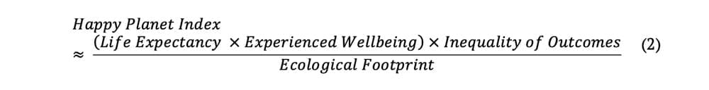 where Life Expectancy is “the average number of years a person is expected to live in each country based on data collected by the United Nations”; Experienced Wellbeing is “how satisfied the residents of each country feel with life overall, on a scale from zero to ten, based on data collected as part of the Gallup World Poll”; Inequality of Outcomes is “the inequalities between people within a country in terms of how long they live, and how happy they feel, based on the distribution in each country’s life expectancy and wellbeing data”; and Ecological Footprint describes “the average impact that each resident of a country places on the environment, based on data prepared by the Global Footprint Network”.[69]
The HPI has a different underlying rationale to some of the other metrics we have considered. Unlike the NZ LSF, SPI, ANS, and GPI, which focus largely on the means through which wellbeing is achieved, the Happy Planet Index is centred around the ends themselves (long and happy lives), measured in direct terms. NEF argue that this approach circumvents assumptions about what makes individuals (un)happy, instead asking them directly through a life satisfaction question, adjusted for length of life, inequality and resources use (or fundamental inputs as they call them).
As discussed in Section 2.4, subjective measures of life satisfaction have been subject to criticisms at the individual level, with mood swings and one-off events potentially affecting an individual’s score on a given day. Some argue that these variations likely balance out when aggregated at the population level. However, others emphasise the longer-term role that cultural factors might play in an individual’s response to subjective wellbeing questions. Another criticism is that such measures tend not to move much over time, making them less useful for policy development. Hence, subjective wellbeing may not be considered a “valid absolute measure of wellbeing”.[70]
With respect to the environment, the HPI takes a theoretically consistent approach to its inclusion by relying on the Ecological Footprint indicator. The Ecological Footprint of a given nation reflects the bio-capacity required to produce all of the natural resources it consumes, and to absorb all of the waste it produces. Although it doesn’t necessarily reflect localised environmental concerns, the Ecological Footprint provides a clear indicator of sustainability at the aggregate level. This aggregation of all impacts into one unit (global hectares) can be criticised as being a reductionist approach to considering the contribution of the environment to human wellbeing. However, in a context where many environmental impacts do not obey country borders, this approach provides a notion of sustainability that is consistent with a global lens of analysis, and which explicitly considers the capacity of future generations to provide for themselves.
Indicator use and outputs
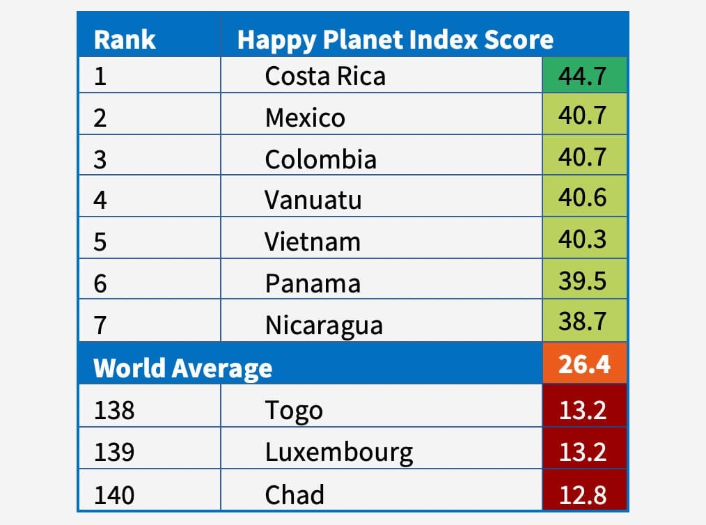
As a decision-making support tool, the HPI has several drawbacks. As soon as there is a change in the SWB indicator, any decision-maker would rightfully ask: what is causing that change? And can I do anything about it? For this, we need some understanding of the drivers of subjective wellbeing, which takes us back to the means of wellbeing delivery, and therefore to the other indicators discussed above. However, the HPI tells a clear, accessible, and relatable story about the world and the people who inhabit it. It challenges notions of wellbeing being tied to economic growth, and paints a vastly different picture of global success. In particular, those countries that are considered successful by traditional metrics, such as GDP, often do not rank highly on the HPI (Table 1).
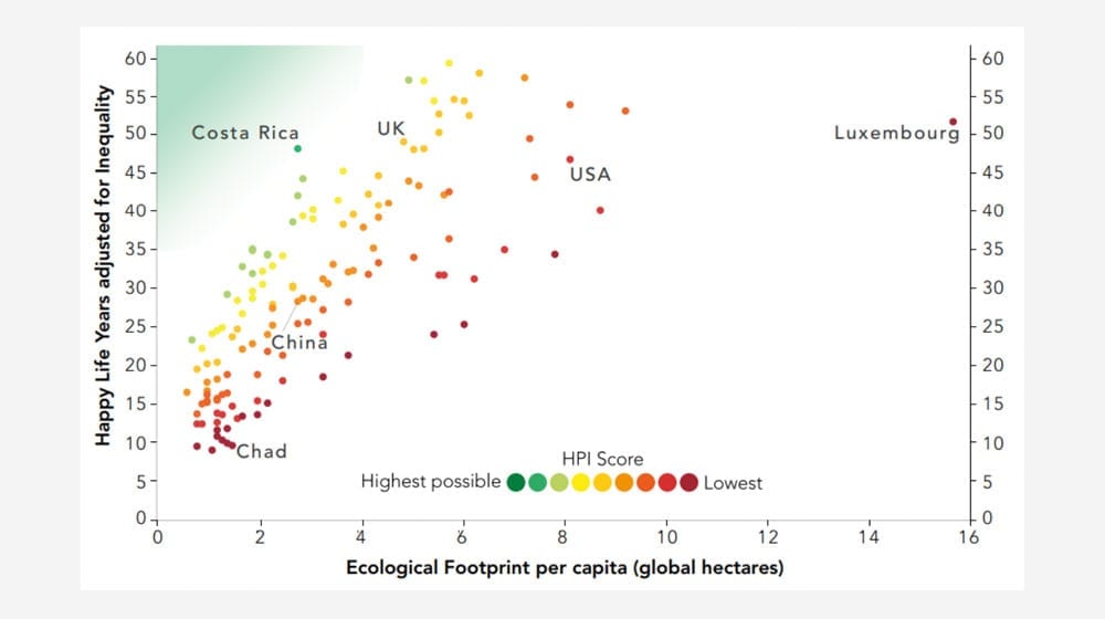
The indicator also lends itself to analyses of the relationship between happiness and ecological impact. It can highlight those countries which appear to be delivering wellbeing in a (relatively) ecologically efficient way. For example, Figure 11 shows that shows that Costa Rica is performing well, achieving almost 50 on the ‘Happy Life Years adjusted for Inequality’ axis, and with a low Ecological Footprint of approximately 2.5.
From this information we can dive deeper in order to understand how these countries achieve their high scores. This then enables us to derive best-practice, from which other countries can potentially learn.
4 | Discussion
The aim of this working paper was to explore the various alternatives to the GDP in measuring prosperity. We have discussed the main criticisms of GDP as a measure of societal progress, outlined four types of alternative indicators, and provided a detailed account of at least one example of each type of indicator. In this final section we synthesise some of the insights from this work and provide a roadmap for navigating some of the challenges in choosing an appropriate indicator, such as the debates around monetisation, aggregation, and subjective wellbeing. Ultimately, we suggest there is a key distinction to be made between those indicators that aim to act as story-telling devices and those that aim to act as decision-aids. We outline the key characteristics for a ‘good’ indicator in each of these contexts.
4.1 Navigating the options
The text in the following section aims to pick up some of the key points of contention from the literature about how best to construct an indicator of societal progress. The debates we focus on here are those that arguably have most relevance for indicator end-users, as they fundamentally change the character of the indicator, meaning that choosing carefully is key. They include the following:
- whether to aggregate the sub-indicators within an index into a small handful of headline indicators, or not;
- whether to monetise all of the sub-indicators within the index; and
- whether to use subjective or objective measures of wellbeing.
As indicated earlier in the report, our choice of indicator categorisation in Section 2 reflects these key debates, distinguishing between dashboard indicator sets, aggregate non-monetary indicators, aggregate monetary indicators and subjective wellbeing indicators. We will now build on our work in earlier sections by bringing a lens of policy and practice to the above questions.
To aggregate or not to aggregate?
As discussed, quality of life indicator sets (dashboards) allow for a detailed, disaggregated view of which aspects of societal progress are changing and in what direction. For this reason, many practitioners believe that they are more useful than composite indicators for policy. However, they can prove unwieldy for decision-making, providing little indication of the tensions or trade-offs between policy areas, and they rarely hit the headlines in the same way that GDP does. It has been argued that aggregate indicators (built from dashboard indicator sets) can overcome these limitations to some degree. First, by giving an accessible headline figure that is easily comparable across contexts. This can be important for delivering a clear and intuitive message to the public, for whom large lists of indicators may seem inaccessible and unengaging.[72] Second, by indicating the relative importance of the sub-indicators through their weightings, aggregate indicators can draw attention to particular policy problems[73] and potential action synergies.
However, this can be a double-edged sword. If the weights chosen for the indicators are either technically arbitrary or socially contestable, then this can create a misleading or contentious impression. In this case, the index is rendered problematic for policy-makers and open to “over-interpretation”.[74] For this reason, some practitioners favour dashboards of indicators as they provide a more direct and meaningful reflection of exactly what change is happening and in which policy areas.[75]
The New Zealand Treasury Living Standards Framework is a prime example of an indicator initiative that has chosen to maintain a dashboard of indicators, applying this disaggregated view across all three of the framework’s domains. This decision not to aggregate in part reflected the political difficulty of weighting indicators, given the subjective and often contested nature of societal progress. This is a struggle which besets any government looking to agree on an appropriate aggregate index for use at the national level. Dashboard indicator sets provide one way around this problem as they can reflect multiple priorities at once, without giving precedent to any one in particular.
Should we monetise everything?
Within the aggregate indices, monetary aggregates provide the unique advantage of delivering information in the language already spoken by decision-makers. This has power in the public domain and policy-making domain, allowing for direct comparisons with GDP. For example, GPI shows that if we consider the loss of valuable ecosystem services, our economic welfare may not be as high as GDP suggests. However, this potential power is tempered by criticisms about the robustness of some of the valuation methodologies used to impute costs or ‘shadow prices’ for environmental and social variables.[76] Further, due in part to these complex underlying methodologies, aggregate monetary indicators are highly susceptible to misinterpretation. To avoid this, practitioners emphasise the need for indicators to be developed in an intuitive way that non-experts can understand.
Monetary aggregate indicators present an interesting dilemma for many environmentally-minded organisations. As highlighted by several practitioners, monetisation of environmental goods and services provides the impression that these things are ultimately fungible; something which may have significant “unforeseen consequences”.[77] It further runs the risks of putting a price tag on nature, such that it can be more easily sold and traded in the traditional market system, which has so far failed to provide it adequate protection. However, the natural capital approach has clearly had some significant successes,[78] possibly due to its greater conceptual concreteness as compared to the more abstract notion of societal wellbeing. Here we can see with clarity the trade-off between taking an idealistic and pragmatic approach to indication. The former being focused on taking a strong ethical stance on the risks of monetising nature, and the latter working within the constraints of a system that recognises and takes seriously dollar values above most other forms of value.
Why use subjective wellbeing indicators?
Finally, subjective wellbeing indicators offer an altogether different approach to capturing the progress of our societies. As the name suggests, they do not try to present a picture of the objective factors that contribute to the wellbeing of individuals or society at large. Instead, they consider the wellbeing outcome directly, by asking individuals about their hedonic (e.g. positive affect) and eudemonic (e.g. life satisfaction) wellbeing. These are often known as ‘happiness’ indicators.
The benefit of this kind of indicator, over the measures discussed above, is that they do not presume to know what contributes to each individual’s wellbeing, as this may vary from person to person (although we of course know that there are at least some basic factors that contribute to everyone’s wellbeing). The single, life evaluation indicators are also immune to the valuation and weighting criticism for aggregate monetary and non-monetary indices. However, they are criticised for potentially allowing people to adjust to being happy with their lot in life, giving governments a ‘get out of jail free card’ on poor delivery of basic human needs. Further, these measures have been found to be highly stable over time[79] and mainly governed by cultural differences in the way that people report their happiness (or not).[80] Subjective indices which ask people’s subjective feelings about objective components of wellbeing are more resilient to this issue, as they can be ground-truthed against the objective measures themselves. This can offer an additional layer of accountability for governments looking to use these indicators to affect policy.
Through this commentary it becomes clear that each of the different indicator types (and the many variations within them) can be more and less useful for different purposes. Given the multitude of alternative indicators of progress that have been developed in the past three decades,[81] in the following section we offer one way of thinking about what makes a ‘good’ indicator, and in what context.
4.2 What makes a good indicator?
The previous section begins an as-yet under-developed discussion about how governments, NGOs and others can effectively navigate the many indicators in order to lobby, campaign, further develop, and/ or use them in their work. However, our discussion so far reflects the literature at large, which has mostly focused on furthering the technical characteristics of alternative indicators of progress, with limited attention paid to identifying what kind of indicators are most appropriate for what purpose, and in what context. We develop this discussion of purpose and context here, making a key distinction between those indicators which aim to act as story-telling devices (i.e. shifting narratives and frameworks of thought), and those indicators which aim to act as decision-aids in policy and practice. We consider what makes a ‘good’ indicator in each of these contexts.
We define ‘story-telling’ indicators as those indicators whose primary aim is to reflect a new vision of societal progress, distinct from the vision embodied by GDP. Through this, these indicators aim to influence the predominant narrative held by the public, policy-makers, business leaders and others about what constitutes progress and prosperity. Indicators whose purpose is to act as a decision-aid, by contrast, aim primarily to provide relevant information to policy-makers and other decision-makers, supporting them in making decisions that affect societal wellbeing. Going beyond the existing literature about what makes a good technical indicator, our arguments draw on the experience of practitioners about which approaches are resonating with end-users and gaining the greatest level of traction. In this way, they aim to reflect the reality of indicator selection and use globally today.
Telling a story about progress
Alternative indicators of progress can be used as narrative or ‘story-telling’ devices. In this way they can hold a number of aims, including: to shift the narrative around societal progress, laying out a vision of what we want society to look like; to change the mind-sets and behaviours of the public, business leaders, and policy-makers, among others; and to disrupt the power of mainstream indicators such as GDP. Successful indicators in this regard have several key characteristics. They paint a clear picture about their vision of societal progress, which resonates with the target audience, but which simultaneously brings into the foreground previously hidden trends. In the case of the public, this might mean the indicator reflects the everyday concerns of citizens with regards to their wellbeing, but also perhaps drives a shift in understanding about how our everyday wellbeing is fundamentally underpinned by the health of the environment. They are also concise and accessible, helping them to achieve headline impact and disrupt the narrative of GDP. These kinds of indicators lend themselves to broad public consumption and use in the political sphere. The Happy Planet Index provides a good example of this kind of indicator use.
The 2006 HPI report was downloaded and read hundreds of thousands of times, across 185 countries worldwide, within two days of its launch.[82] Its wide readership could be partially attributable to the fact that the idea of progress encapsulated in this indicator is simple and resonant. It asks: are we achieving longer, happier lives, for more people, at smaller cost to the environment? This is a notion of progress that most people can both understand intuitively and support actively. It makes no mention of economics, costs or benefits, but simply appeals to our most basic notions of what it means to live well on a finite planet. This does, however, make it a limited indicator in many respects. It cannot be used to make detailed policy decisions due to the incomplete and high-level nature of the indicator. It also cannot effectively appeal to budget decision-makers to fund environmental protection or renewable energy programmes due to its absence of economic factors. In this way, we argue that the HPI plays an important but limited role in the indicator arena: shifting the public narrative on what we consider a worthwhile vision of progress.
The Human Development Index has played a similar role by telling a story about the development of societies, beyond GDP. Since its development in 1990 it has received ongoing attention in the media and is arguably the most widely known and discussed alternative indicator of progress. As an indicator that is primarily targeted towards governments—holding them to account against its new vision of progress—it does a good job on many counts. Its sub-indicators are simple and intuitive, and the data is almost universally available at the national level. However, the HDI is closely correlated with GDP[83] and has a very limited set of indicators, notably missing any environmental components at all. In this way, we argue that it is in fact not an effective tool for building a new narrative about societal progress.
These two examples highlight an important tension between the radicalness of an indicator and its likely traction in the media and with government. Ultimately, conventional ideas about economics and the relationship between income and wellbeing act as a barrier to the use of more radical indicators. Hence, indicators like the Happy Planet Index may be seen as telling a story that is detached from reality and not grounded in solid economic theory.
There is still a need then for indicators that have the power to disrupt the story told by GDP as the main indicator of societal progress for the last 50 years. Few have come close to achieving this in a sustained way. Some individual indicators, such as carbon dioxide emissions and Ecological Overshoot Day have enjoyed high levels of media attention, comparable to that of GDP, but neither tell a coherent and resonant story about the core elements of what makes a society prosperous and sustainable.
Supporting decision-making
Indicators can also be useful in a decision-making context. There is a wide literature on the different ways in which indicators are used and how they influence policy. These include instrumental use (direct and linear use in decisions), conceptual use (shaping individuals’ ways of thinking), and political use (influencing political agendas).[84] These different types of use bring into focus a number of important factors to consider when looking at what makes a ‘good’ indicator in a decision-making context, including:
- indicator characteristics, such as the type of indicator, the robustness of the underlying methodology, and the quality of the data;
- end-user characteristics, such as the views and belief systems of end-users; and
- political conditions in which the indicators are likely to be embedded.
Much of the alternative indicator literature to date has focused on the first point about what technical characteristics make for a good indicator. We have elaborated in the previous sections on a number of the key debates in this respect. In particular, we have discussed the advantages of disaggregated indices in making detailed policy decisions, but their limitations in setting a political agenda. We have also weighed up the potential advantages and disadvantages of monetising the sub-indicators within an index: gaining rhetorical power but opening the index up to criticism about its robustness. Beyond what has been discussed in this report, there is also literature and practice focused on improving the quality of available data and advancing valuation methodologies for various wellbeing and natural capital components. Further, many have tried to improve the mapping of indicator domains and indicator content onto policy domains in order to enhance their relevance for policy-makers.
However, of arguably equal importance in determining what makes a successful indicator in the policy-making sphere are end-user characteristics. In particular, the “expectations, belief systems [and] mental models” of end-users can sometimes have a greater impact on their use than any technical characteristics of the indicator itself.[85] This draws partly on literature about the ways that people use cognitive shortcuts to decide what types of information are trustworthy, and what types they should reject. Intuitively, people are more likely to accept information that aligns with their world-view than that which does not.[86] This highlights the importance of involving end-users in the development of indicators and gives credence to the view that indicators are (at least in some part) a social construct.
Through this perspective we can put many of the debates about the technical qualities of alternative indicators, as compared to GDP, in context. Despite their seeming difficulties, these alternative indicators are arguably no more complex or flawed than GDP. For all its apparent concreteness, GDP only appears so because consensus was forged around what should be included and how it should be constructed. Acknowledging and understanding this social construction of indicators enables us to think more broadly about what makes a successful indicator, and in what context.
Finally, the political conditions in which the indicators are likely to be deployed can either serve to enable their use and influence, or to hinder it. The NZ LSF is a particularly important example of how political conditions can act as a catalyst for the development and deployment of alternative indicators of societal progress. The development of the NZ LSF was driven primarily by the Chief Economist over the course of 10 years. This support was re-doubled when the new government took office in 2017. The complementary support of high-level civil servants and enthusiastic ministers gave the framework the traction it needed to be properly embedded in treasury budgetary processes.
5 | Concluding remarks
Many bodies have cause to be interested in alternative indicators of progress, beyond GDP. They are seen as a useful instrument to help shift public mindsets and political priorities, as well as having the potential to directly inform policy-making by providing timely information about specific policy domains. However, the many dozens of alternative indicators that have been developed to augment, complement or replace GDP can be challenging to navigate due to the diversity of their methodologies, their goals, and their visions of society.
This working paper has aimed to guide interested parties through this ecosystem of indicators. We have walked through the main criticisms of GDP as an indicator of progress, outlined the four main types of alternative indicator (dashboard indicator sets, aggregate non-monetary indicators, aggregate monetary Indicators, and subjective wellbeing indicators), and detailed five case studies which sit across the four indicator types. In the discussion, we then synthesised the main debates in the literature around indicator aggregation, monetisation, and the use of subjective wellbeing indicators, through a lens of policy and practice.
Through laying this road map for navigating the many indicators of societal progress, the importance of context and purpose in defining what makes a ‘good’ indicator, and in determining the likely success and influence of an indicator, has become starkly apparent. In light of this, we propose a key distinction between those indicators that aim to act as narrative devices, changing the hearts and minds of the public and policy-makers alike, and those that aim to act directly as decision-aids. A successful indicator in each of these two contexts requires a very different set of characteristics.
To tell an effective story, the vision captured in the indicator must be clear and distinct from that captured by GDP. These indicators can benefit from simplicity and aggregation, allowing them to jostle with GDP on the public stage. By contrast, those indicators that aim to support policy-making require closer attention to technical characteristics, with disaggregation and high quality data providing the robust basis needed for detailed decision-making. Of equal importance is active consideration of the characteristics of end-users when developing the indicator, and close attention to the political context in which the indicator is likely to be deployed.
This nuanced lens through which we consider the many alternative indicators of societal progress highlights the fact that there is no one perfect indicator that can supplant GDP in every context. Their construction requires consideration of a range of factors. Hence, greater clarity about what each indicator is aiming to achieve would help organisations navigate them more effectively.
This work presents a tentative first step in the development of a framework for defining what constitutes a ‘good’ indicator in different contexts. We build on the body of work looking at types of indicator use in the policy-making arena, grounding our reflections in the insights of practitioners from the NGO, national policy and international governance levels. Further development of this work would support more targeted and effective application of indicators in all spheres of use.
Notes
[1] Smeets, E. and Weterings, R., 1999. Environmental indicators: Typology and overview (p. 19). Copenhagen: European Environment Agency.
[2] Van den Bergh, J.C., 2009. The GDP paradox. Journal of Economic Psychology, 30(2), pp.117-135.
[3] Jackson, T., 2010. Reviewing the research: Report of the commission on the measurement of economic performance and social progress. Environment, 53(1), pp.38-40.
[4] Stevenson, B. and Wolfers, J., 2013. Subjective well-being and income: Is there any evidence of satiation?. American Economic Review, 103(3), pp.598-604.
Gerdtham, U.G. and Johannesson, M., 2001. The relationship between happiness, health, and socio-economic factors: results based on Swedish microdata. The Journal of Socio-Economics, 30(6), pp.553-557.
Diener, E., Sandvik, E., Seidlitz, L. and Diener, M., 1993. The relationship between income and subjective well-being: Relative or absolute?. Social indicators research, 28(3), pp.195-223.
[5] Easterlin, R.A., McVey, L.A., Switek, M., Sawangfa, O. and Zweig, J.S., 2010. The happiness–income paradox revisited. Proceedings of the National Academy of Sciences, p.201015962.
[6] Loayza, N.V. and Raddatz, C., 2010. The composition of growth matters for poverty alleviation. Journal of development economics, 93(1), pp.137-151.
Hickel, J., 2019. A Letter to Steven Pinker (and Bill Gates, for that matter) About Global Poverty. Class, Race and Corporate Power, 7(1), p.3.
[7] Kahneman, D. and Deaton, A., 2010. High income improves evaluation of life but not emotional well-being. Proceedings of the national academy of sciences, 107(38), pp.16489-16493.
[8] Cavallo, E., and Noy, I., 2010. The Economics of Natural Disasters. A Survey. IDB Working Paper Series N. IDB-WP-124. Inter-American Development Bank. pp. 5-31.
[9] Kubiszewski, I., Costanza, R., Franco, C., Lawn, P., Talberth, J., Jackson, T. and Aylmer, C., 2013. Beyond GDP: Measuring and achieving global genuine progress. Ecological Economics, 93, pp.57-68.
[10] Office for National Statistics, 2016. Women shoulder the responsibility of ‘unpaid work’. Office for National Statistics.
[11] Haight, A.D., 2007. Diagram for a small planet: the production and ecosystem possibilities curve. Ecological Economics, 64(1), pp.224-232.
[12] Jackson, T. and McBride, N., 2005. Measuring progress. A review of ‘adjusted’ measures of economic welfare in Europe.
[13] Kubiszewski et al. 2013 (ref 9)
[14] Costanza, R., Erickson, J., Fligger, K., Adams, A., Adams, C., Altschuler, B., Balter, S., Fisher, B., Hike, J., Kelly, J. and Kerr, T., 2004. Estimates of the genuine progress indicator (GPI) for Vermont, Chittenden County and Burlington, from 1950 to 2000. Ecological Economics, 51(1-2), pp.139-155.
[15] Jackson, 2018. Beyond Redistribution—Confronting inequality in an era of low growth. APPG on Limits to Growth, pp.1-6
[16] Wilkinson, R., and Pickett, K., 2010. The spirit level: Why equality is better for everyone. Penguin UK.
[17] Fleurbaey, M., 2009. Beyond GDP: The quest for a measure of social welfare. Journal of Economic literature, 47(4), pp.1029-75.
[18] Barrington-Leigh, C. and Escande, A., 2018. Measuring progress and well-being: A comparative review of indicators. Social Indicators Research, 135(3), pp.893-925.
[19] Barrington-Leigh and Escande, 2018 (ref 18)
[20] Bleys, B., 2012. Beyond GDP: Classifying alternative measures for progress. Social Indicators Research, 109(3), pp.355-376.
[21] Jackson and McBride, 2005, p7 (ref 12)
[22] Elfar, S., and Bras, F., 2018. UK data gaps: Inclusive Data Action Plan towards the global Sustainable Development Goal indicators. Office for National Statistics.
[24] Jackson and McBride, 2005, p7 (ref 12)
[25] Barrington-Leigh and Escande, 2018, p904 (ref 18)
[26] Centre for Bhutan Studies & GNH Research, 2016. A COMPASS TOWARDS A JUST AND HARMONIOUS SOCIETY. 2015 GNH Survey Report. Centre for Bhutan Studies & GNH Research.
[27] Barrington-Leigh and Escande, 2018 (ref 18); Jackson and McBride, 2005 (ref 12)
[28] Barrington-Leigh and Escande, 2018, p905 (ref 18)
[29] Becker, R. A., L. Denby, R. McGill and A. R. Wilks: 1987, ‘Analysis of data from the Places Rated Almanac’, The American Statistician 41, pp. 169–186.
[30] Bolt, K., Matete, M. and Clemens, M., 2002. Manual for calculating adjusted net savings. Environment Department, World Bank, pp.1-23.
[31] Jackson and McBride, 2005, p18 (ref 12)
[32] Barrington-Leigh and Escande, 2018, p903 (ref 18)
[33] Jackson and McBride, 2005, p9 (ref 12)
[34] Diener, E., Inglehart, R. and Tay, L., 2013. Theory and validity of life satisfaction scales. Social Indicators Research, 112(3), pp.497-527.
Diener, E., 2000. Subjective well-being: The science of happiness and a proposal for a national index. American psychologist, 55(1), p.34.
Campbell, A., 1976. Subjective measures of well-being. American psychologist, 31(2), p.117.
[35] Barrington-Leigh and Escande, 2018, p914 (ref 18)
[36] The Treasury, 2018. Treasury paper. Living Standards Framework: Introducing the Dashboard. The New Zealand Treasury
[37] Civic engagement and governance; cultural identity; environment; health; housing; income and consumption; jobs and earnings; knowledge and skills; time use; safety and security; social connections; subjective wellbeing (those in bold only appear in the “our country” portion of the dashboard)
[38] The Treasury, 2018, p1 (ref 36)
[39] https://data.oecd.org/lprdty/labour-productivity-and-utilisation.htm
[40] The Treasury, 2018, p7 (ref 36)
[41] The Treasury, 2018 (ref 36)
[42] The Treasury, 2019. Budget Policy Statement 2019. New Zealand Treasury. Available at:
https://treasury.govt.nz/publications/budget-policy-statement/budget-policy-statement-2019
[43] https://www.nzae.org.nz/wp-content/uploads/2017/07/Anita-King.pdf
[44] Sen, A., 2005. Human rights and capabilities. Journal of human development, 6(2), pp.151-166.
[45] Stern, S. and Wares, A., 2014. Social progress index 2014. Methodological Approach. Washington: Social Progress Imperative, p6
[46] Stern and Wares, 2014, p6 (ref 45)
[47] Stern and Wares, 2014, p8 (ref 45)
[48] Stern and Wares, 2014, p8 (ref 45)
[49] Social Progress Imperative, 2018. 2018 Social Progress Index Executive Summary. Washington: Social Progress Imperative
[50] Social Progress Imperative, 2018, p14 (ref 49)
[51] Jarvis, M., Lange, G.M., Hamilton, K., Desai, D., Fraumeni, B., Edens, B., Ferreira, S., Li, H., Chakraborti, L., Kingsmill, W. and Ruta, G., 2011. The changing wealth of nations: measuring sustainable development in the new millennium, p37
[52] The World Bank, 2012. Contribution to Beyond GDP, “Virtual Indicator Expo”. Environment Department, The World Bank. Available at: http://ec.europa.eu/environment/beyond_gdp/download/factsheets/bgdp-ve-ans.pdf
[53] Pearce, D.W. and Atkinson, G.D., 1993. Capital theory and the measurement of sustainable development: an indicator of “weak” sustainability. Ecological economics, 8(2), pp.103-108.
[54] Gutés, M.C., 1996. The concept of weak sustainability. Ecological economics, 17(3), pp.147-156.
[55] https://databank.banquemondiale.org/data/source/adjusted-net-savings/preview/on
[56] http://documents.worldbank.org/curated/en/239271500275879803/
pdf/ 117480-PUB-Date-6-29-2017-PUBLIC.pdf
[57] https://www.wavespartnership.org/en/about-us
[58] Daly, H. and Cobb, J.J., 1990. For the Common Good. Green Print.
[59] Stockhammer, E., Hochreiter, H., Obermayr, B. and Steiner, K., 1997. The index of sustainable economic welfare (ISEW) as an alternative to GDP in measuring economic welfare. The results of the Austrian (revised) ISEW calculation 1955–1992. Ecological Economics, 21(1), pp.19-34.
[60] Posner, S.M. and Costanza, R., 2011. A summary of ISEW and GPI studies at multiple scales and new estimates for Baltimore City, Baltimore County, and the State of Maryland. Ecological Economics, 70(11), pp.1972-1980.
[61] Lawn, P.A., 2005. An assessment of the valuation methods used to calculate the index of sustainable economic welfare (ISEW), genuine progress indicator (GPI), and sustainable net benefit index (SNBI). Environment, Development and Sustainability, 7(2), p185
[62] Jackson, J., McBride, N., Abdallah, S., and Marks, N., 2008. Measuring Regional Progress: A Regional Index of Sustainable Economic Well-Being (R-ISEW) for all the English Regions. New Economics Foundation, pp.1-81
[63] McGuire, S., Posner, S. and Haake, H., 2012. Measuring Prosperity: Maryland’s Genuine Progress Indicator. Solutions, 3(2), pp.50-58.
[64] Bagstad, K.J., Berik, G. and Gaddis, E.J.B., 2014. Methodological developments in US state-level genuine progress indicators: toward GPI 2.0. Ecological Indicators, 45, p476
[65] http://dnr.maryland.gov/mdgpi/Pages/Policy-Making-Calculator.aspx
[66] Kubiszewski, I., Costanza, R., Franco, C., Lawn, P., Talberth, J., Jackson, T. and Aylmer, C., 2013. Beyond GDP: Measuring and achieving global genuine progress. Ecological Economics, 93, pp.57-68.
[67] https://neweconomics.org/2006/07/happy-planet-index
[68] NEF, 2016. Happy Planet Index 2016: Methods Paper. London, New Economics Foundation, p1
[69] NEF, 2016. The Happy Planet Index 2016: A global index of sustainable wellbeing. London, New Economics Foundation, p1
[70] Eckersley, R., 2009. Population measures of subjective wellbeing: How useful are they?. Social Indicators Research, 94(1), p9
[71] Jeffrey, K., Wheatley, H., Abdallah, S. (2016) The Happy Planet Index: 2016. A global index of sustainable well-being. London: New Economics Foundation.
[72] Barrington-Leigh and Escande, 2019 (ref 18)
[73] Sebastien and Bauler, 2013 (ref 73)
[74] This point was made to us by a former practitioner from the European Commission with whom we spoke in the course of the research underlying this paper.
[75] As emphasised by two of our respondents: a practitioner from NZ LSF and a former practitioner from the OECD.
[76] Lawn, P.A., 2005. An assessment of the valuation methods used to calculate the index of sustainable economic welfare (ISEW), genuine progress indicator (GPI), and sustainable net benefit index (SNBI). Environment, Development and Sustainability, 7(2), pp.185-208.
[77] According to a former UK civil servant from HM Treasury and DEFRA.
[78] WAVES, 2019. Natural Capital Accounting. World Bank. Available at: https://www.wavespartnership.org/en/natural-capital-accounting
[79] Sandvik, E., Diener, E. and Seidlitz, L., 2009. Subjective well-being: The convergence and stability of self-report and non-self-report measures. In Assessing well-being (pp. 119-138). Springer, Dordrecht.
[80] Diener, E., Oishi, S. and Lucas, R.E., 2003. Personality, culture, and subjective well-being: Emotional and cognitive evaluations of life. Annual review of psychology, 54(1), pp.403-425.
[81] Yang, L., 2014. An Inventory of Composite Measures of Human Progress. UNDP Human Development Report Office, pp 5-117
[82] Abdallah, S. and Marks, N., 2014. Happy Planet Index. Encyclopedia of Quality of Life and Well-Being Research, pp.2684-2688.
[83] Cahill, M.B., 2005. Is the human development index redundant?. Eastern Economic Journal, 31(1), pp.1-5.
[84] Lehtonen, M., Sébastien, L. and Bauler, T., 2016. The multiple roles of sustainability indicators in informational governance: between intended use and unanticipated influence. Current Opinion in Environmental Sustainability, 18, pp.1-9.
[85] Sébastien, L., Bauler, T. and Lehtonen, M., 2014. Can indicators bridge the gap between science and policy? An exploration into the (non) use and (non) influence of indicators in EU and UK policy making. Nature and Culture, 9(3), pp.316-343.
Sébastien, L. and Bauler, T., 2013. Use and influence of composite indicators for sustainable development at the EU-level. Ecological Indicators, 35, p3
[86] Zagorin, P., 1998. Francis Bacon. Princeton: Princeton University Press
Acknowledgements
This paper is based on a review commissioned by WWF. The financial support of the Economic and Social Research Council for the Centre for the Understanding of Sustainable Prosperity (ESRC grant no: ES/M010163/1) is gratefully acknowledged.
The full paper is available for download in pdf | Corlet Walker, C and T Jackson 2019: Measuring Prosperity—Navigating the Options. CUSP Working Paper No 20. Guildford: University of Surrey.